Pearl Coffee
A revolutionary way to experience your morning coffee
Brand Identity • Logo Design • Website Design
My Role: Senior Designer
Brand concept creation, logo design, brand assets execution
Year: 2018
Client: Mere Coffee
Agency: Born & Bred
Creative Director: George De’Ath
Pearl, formerly known as Mere Coffee, is revolutionizing the way people experience their favorite cup of joe. It blends two seemingly different industries—coffee and technology—to create a truly unique coffee experience. Pearl developed its own coffee machine using technology formulated by a team of engineers with backgrounds at the Massachusetts Institute of Technology (MIT).
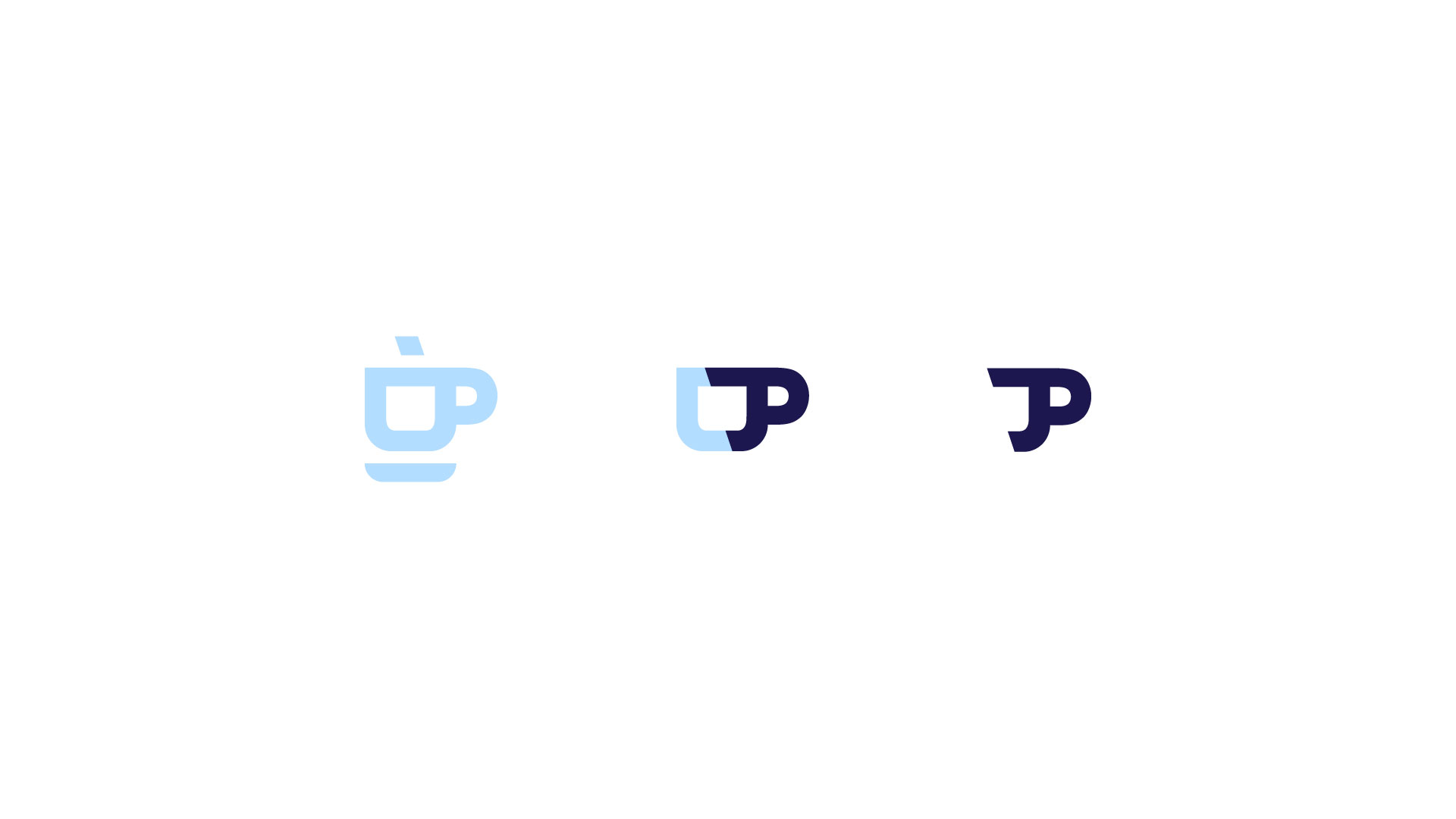
So much goes into a cup of coffee. Pearl’s mission to deliver a delectable cup of coffee with the speed and efficiency of technology inspired its new logo. Pearl’s logo is based on the shape of a simple coffee cup that is sliced in half using a dynamic diagonal line, evoking the feeling of quick-moving fluidity.
Similarly to natural pearls that take years to develop and are wholly unique, Pearl is rare in its approach to coffee. After years of fine-tuning the engineering of their coffee machine and cultivating relationships with the best partners and manufacturers, Pearl has fervently established their craft in hopes of becoming the crown jewel in the coffee industry.
Besides giving Pearl a timeless, but strong and elegant name we also incorporated royal colors and clean digital typography into Pearl’s branding to evoke a classic, bold aesthetic that will adapt to an in-home kitchen or a corporate office, upscale hotel, or modern restaurant.


